Context
Disguise builds the software that runs the world's biggest live shows. U2. Adele. The Las Vegas Sphere. The core product was already successful. To expand what they could offer production teams, they made a deliberate strategic move: acquiring three specialist companies, each building tools for different parts of the production workflow. Drive for asset management. Previz for pre-visualisation. Mapping Matter for projection planning.
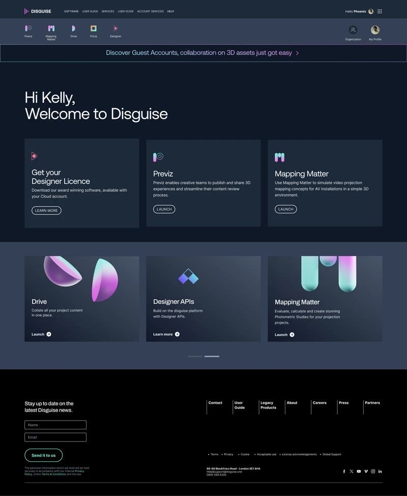
The intent was an ecosystem. The reality was three products built on different tech stacks, with different design languages, none of which felt like they belonged together.
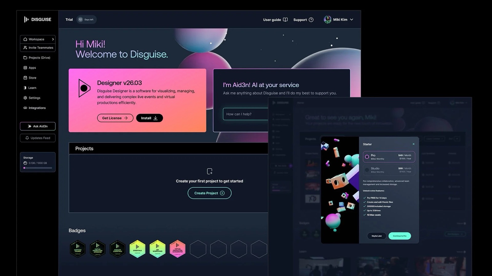
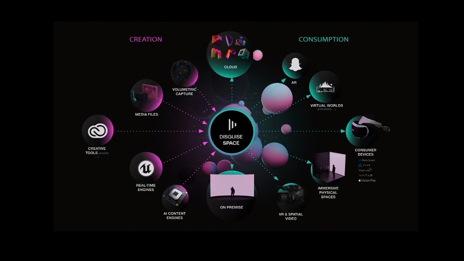
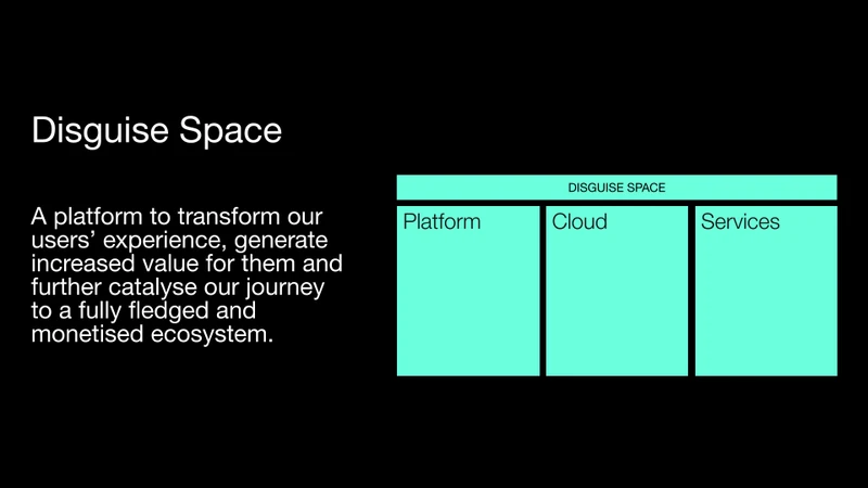
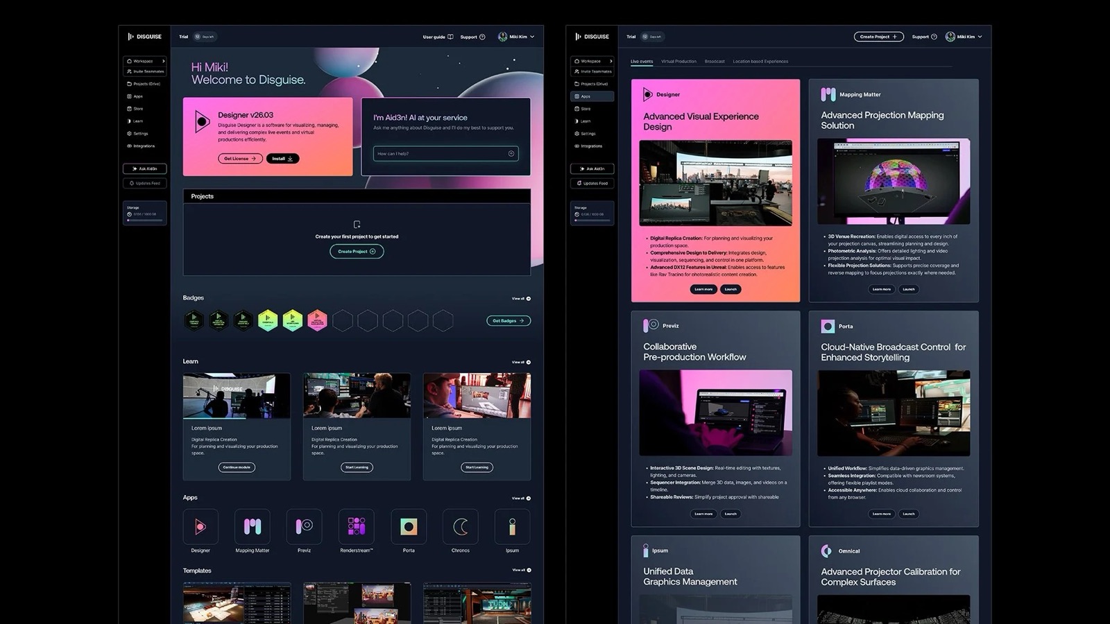
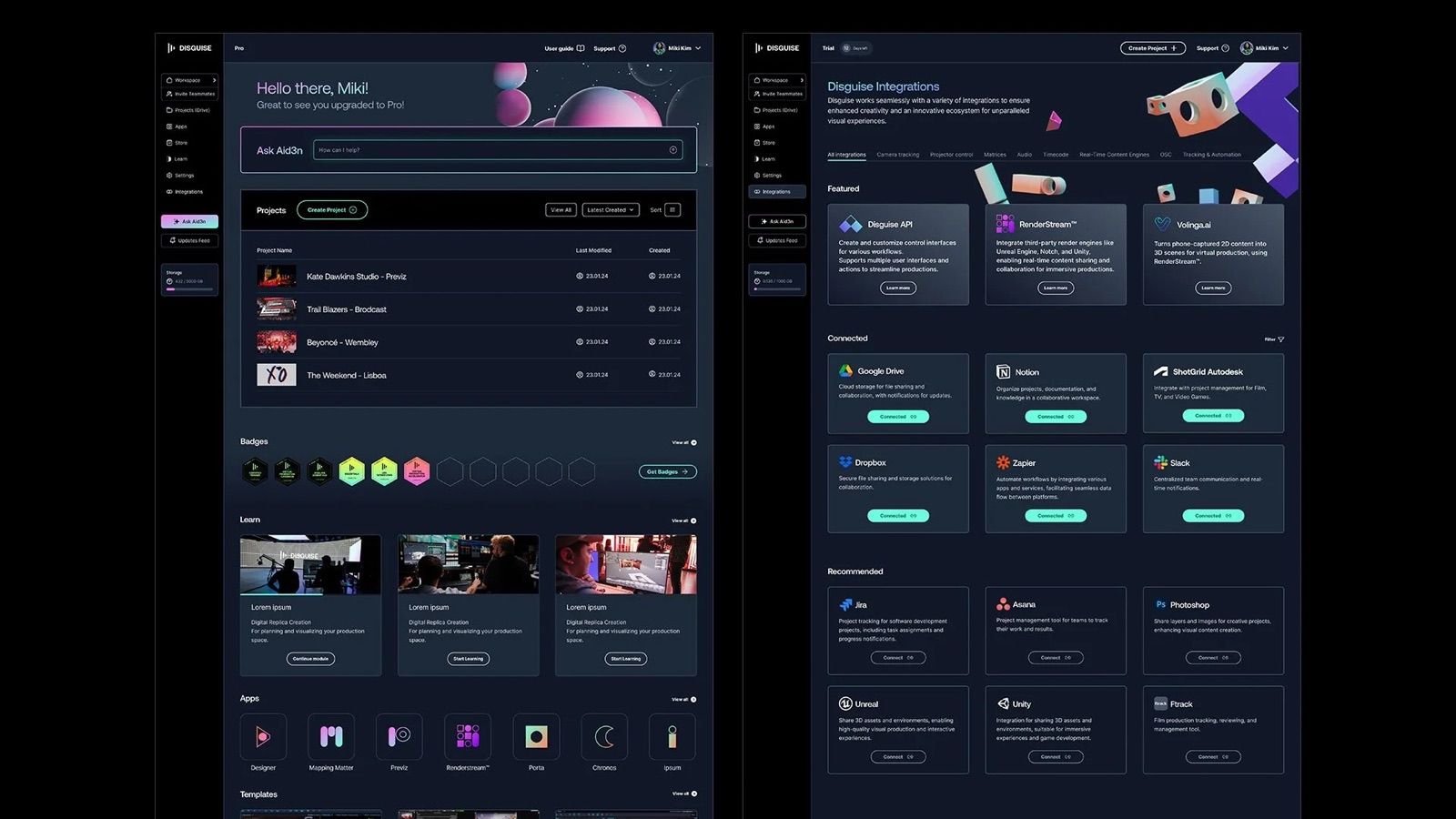
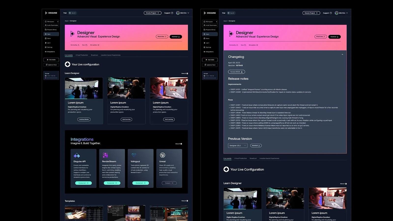
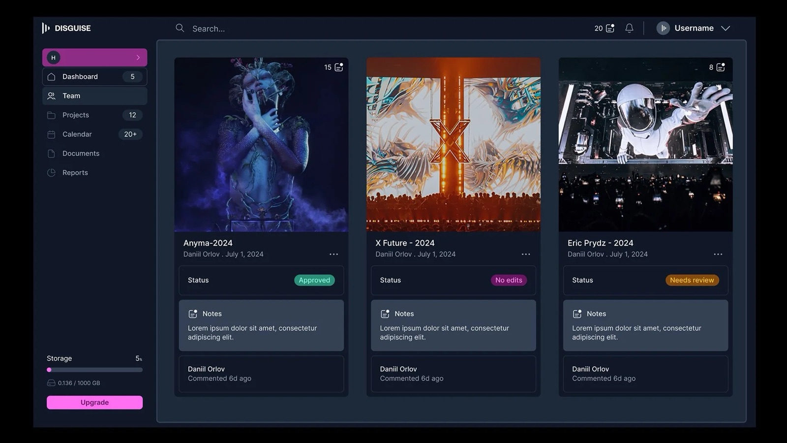
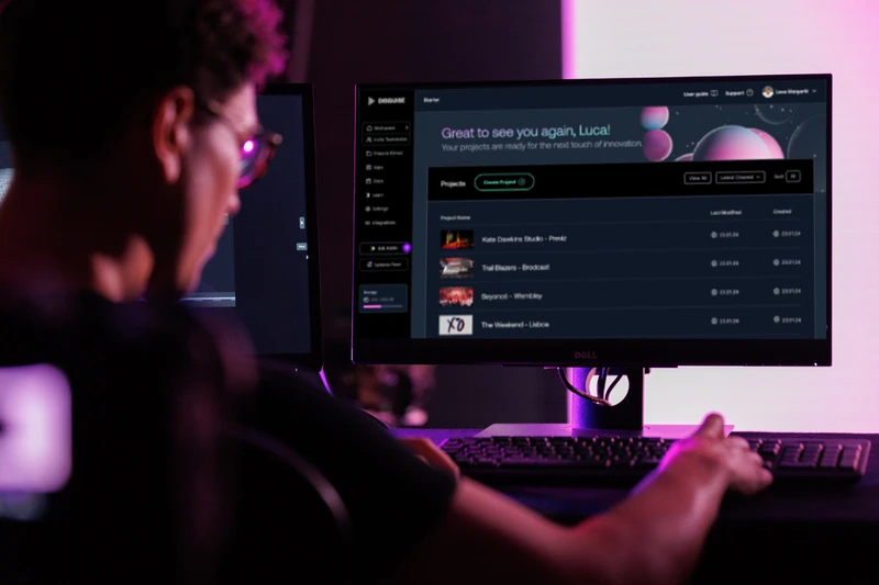
I joined as Product Experience Lead to design Disguise Space: the hub that would allow operators, studios, and broadcast engineers to manage their entire Disguise workflow in one place, without switching between tools that didn't know each other existed.
The Problem
The fragmentation wasn't a failure of planning. It was the predictable cost of moving fast through acquisition. Each of the three acquired products worked. The problem was that working independently was no longer enough.
Production teams coordinating major touring shows operate across multiple countries, time zones, and crew configurations. A pre-visualisation team working in Previz, an operator managing assets in Drive, and an engineer calibrating with Mapping Matter were all working on the same show, with no shared context between their tools. No unified project view. No single place to manage permissions or access. No way for anyone to see the full picture.
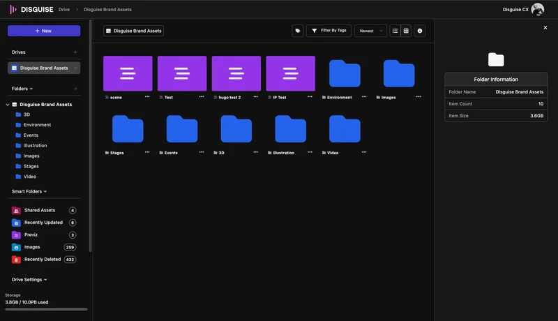
Drive was the closest thing to a hub. But it had been positioned and built as a technical integration rather than a workflow centre. Operators in the Live vertical couldn't see how it connected to their show-day work. Low adoption wasn't a features problem. It was a positioning problem.
For Disguise as a business, this was a credibility problem. Studios and production companies choosing their platform infrastructure want a coherent system. What Disguise was offering looked like a collection of tools. Those are very different things to sell.
Research & Discovery
I ran a research programme with production operators across four verticals: Live, Broadcast, Virtual Production, and Location-Based Experiences. These were not lab sessions. They were contextual conversations with specialists who work under pressure and have strong opinions about what gets in their way.
I also sat with the Cloud engineering team early and mapped the technical architecture. Not because I wanted to know how to code it. Because the right design solution had to be one they could actually build. Any approach that ignored the codebase constraints would have failed in implementation.
Key Findings
- Users were not confused by specific interaction patterns. They were confused by the underlying conceptual model. Drive felt like a separate destination because it had been built and positioned as one.
- Drive's low adoption was a positioning problem, not a features problem. Operators in the Live vertical couldn't see how it connected to their show-day workflow. The same product was failing different audiences for different reasons.
- The engineering team was maintaining separate codebases per app. That divergence was directly causing slow iteration cycles and growing visual inconsistency. Any design solution that ignored the codebase problem would not survive implementation.
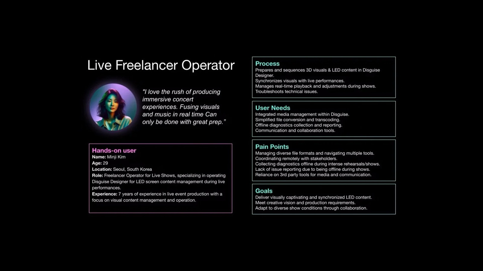
- Role and vertical context mattered. A Live operator, a VP supervisor, and a broadcast engineer had different entry points, different priorities, and a different relationship to the same tools. A single generic onboarding flow couldn't serve all of them.
My Thinking
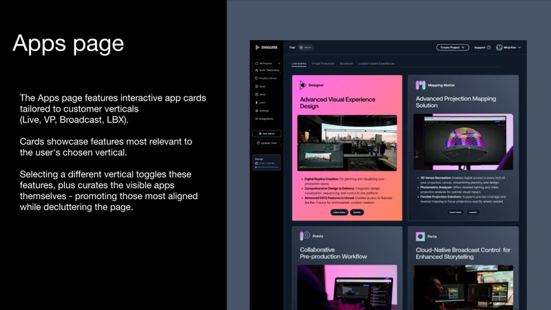
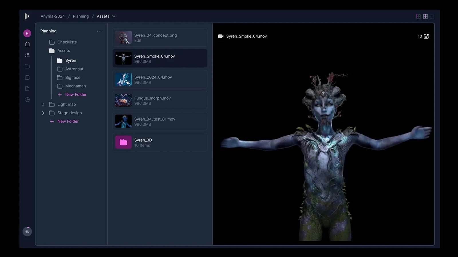
Drive was the first call. I could have kept it as a separate app with a better integration story: clearer links, shared login, more visible from the hub. I chose instead to make Drive a first-class feature embedded inside Disguise Space. A lighter integration would have preserved the fragmentation at the conceptual level. Users would still think of Drive as something to switch into, not a natural part of their workflow. Embedding it was the only way to change that mental model.
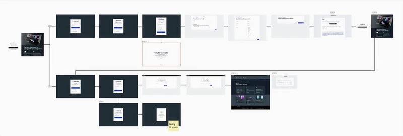
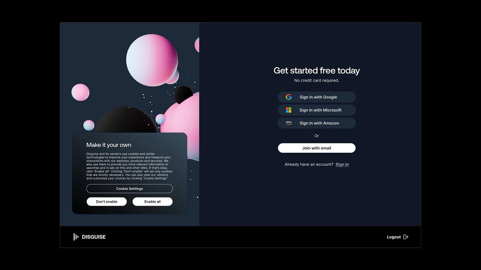
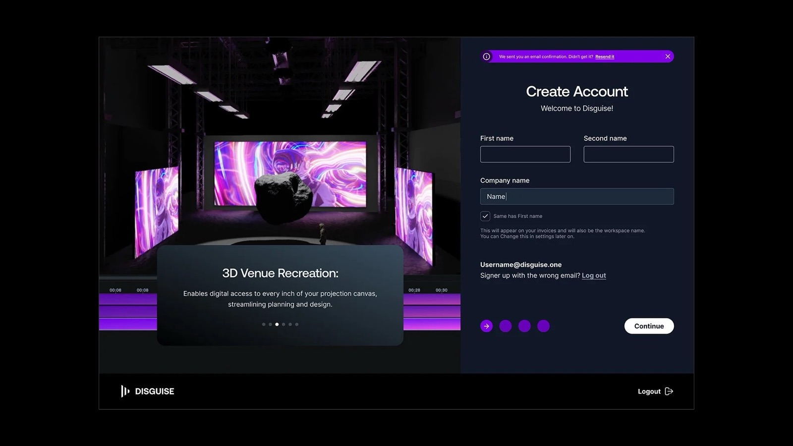
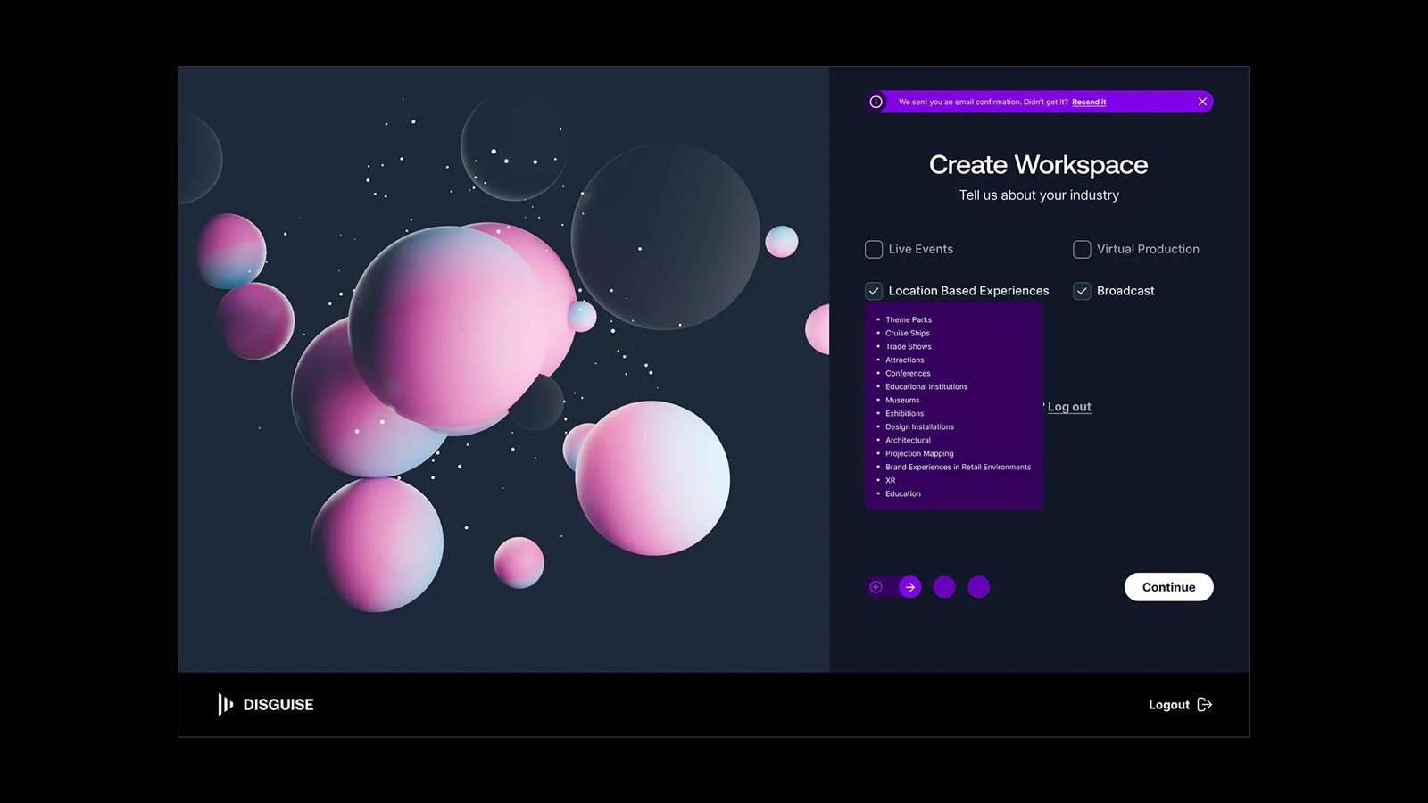
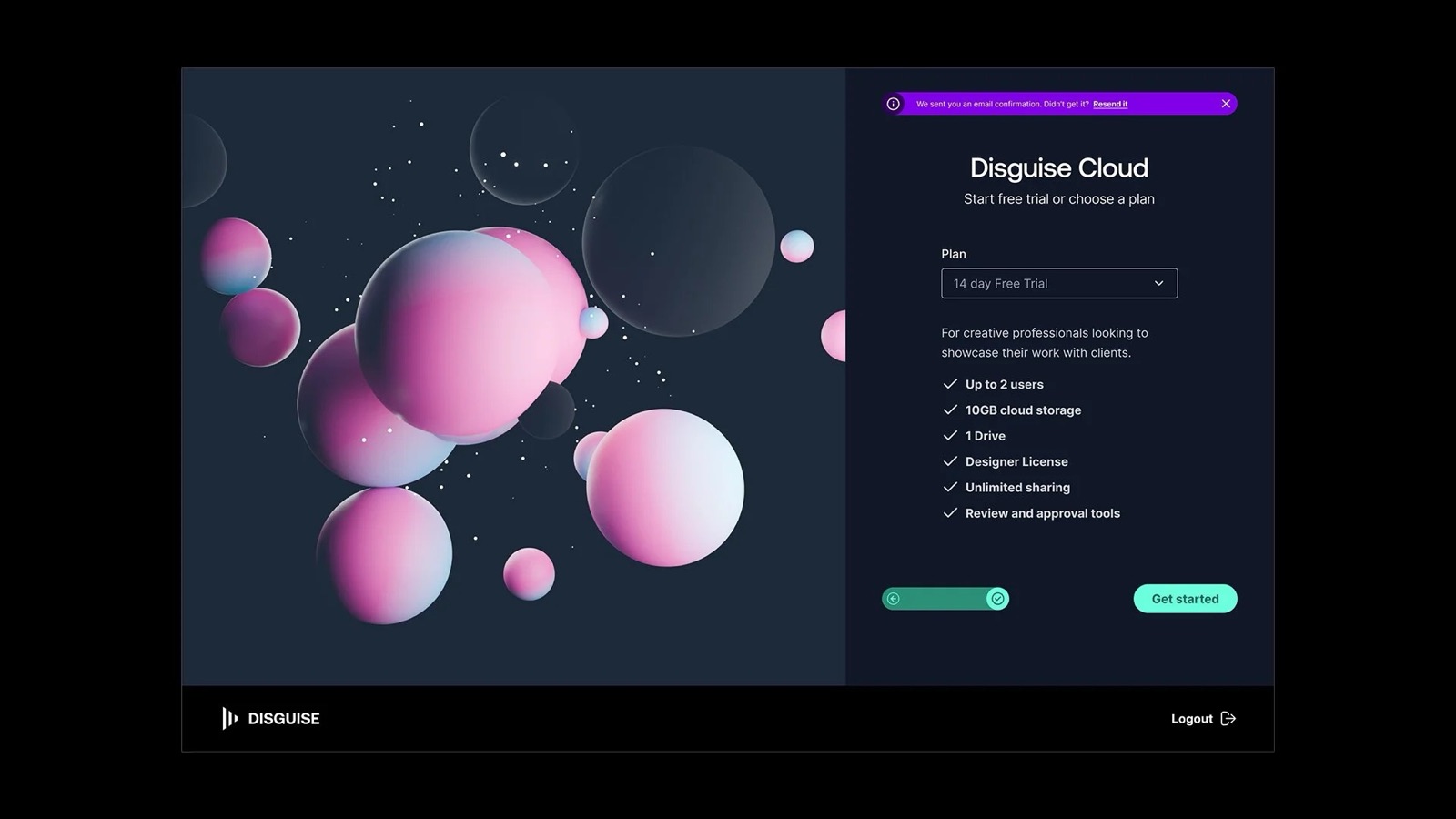
Onboarding came next. Rather than a generic welcome flow, I designed one that actively collects role and vertical data up front. Live, Broadcast, VP, LBX. The research had shown that Drive's low perceived value was partly a relevance problem. Users weren't seeing how it connected to their specific kind of work. Role-aware onboarding makes that connection on first use, not after they've already given up.
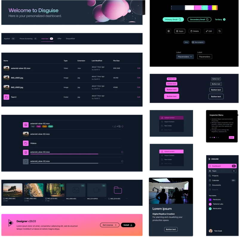
One decision shaped the entire execution: I pushed for a shared component library, BrandOS, rather than letting each app team iterate in parallel and reconcile later. Parallel work promised faster short-term progress and a design-language fix in some future sprint. That was a false economy: the engineering team was already paying the cost of diverged codebases. A shared UI library and a shared codebase had to move together. Designing in parallel would have compounded the problem, not solved it.
My Role & The Team
I owned the end-to-end discovery and design phases: UX strategy, problem scoping, research programme, information architecture, and directing the Figma prototype through to a testable state. The key decisions about platform structure, Drive's integration model, and onboarding were mine.
The PM owned the roadmap and stakeholder alignment. A UI designer led visual execution within BrandOS once direction was set. Engineering, specifically the Cloud solution team, were essential throughout. Those conversations shaped what was architecturally feasible and made sure the design wasn't making promises the codebase couldn't keep.
Joe's collaborative style is one of his greatest strengths. He fosters strong partnerships between developers, UI designers, and stakeholders, creating a process that is both efficient and highly creative. His clear communication and practical problem-solving have helped improve the coherence of our designs while ensuring we respond effectively to user feedback and business needs.
The Outcome
Prototype testing showed users completing core tasks faster and reporting fewer moments of confusion compared to the existing Cloud experience. What the engineering team flagged separately: the BrandOS codebase had already cut their iteration time on the first sprint after handoff.
Drive's adoption problem was always a positioning problem. Repositioning it as an embedded feature rather than a parallel app is expected to change that. The direction was signed off by product leadership, building on the Disguise Cloud suite of Drive, Previz and Mapping Matter. The platform is in active development, with the engineering team building on the foundation established during this phase.
What's Next
The immediate design intent was to deepen the Drive integration and expand role-specific dashboards across all four verticals. BrandOS was scoped to extend into the desktop application, bringing the shared design language into the core production software used on every show.