Context
Mapping Matter is a web-based projection mapping tool used by production planners and AV designers to simulate, validate, and document projection setups before a show goes into production. It sits within the Disguise Cloud ecosystem alongside Drive and Previz.
Disguise is an Emmy Award-winning technology company whose software powers some of the world's most iconic productions: Eurovision, Coachella, The Chemical Brothers, Frozen Forever at Disneyland. I was brought in as Product Experience Lead to lead the redesign of Mapping Matter 2.0, working with a UI designer on visual execution within the Disguise OS design system.
The Problem
Planning a projection mapping setup is technically demanding work done under commercial pressure. Production planners need to model complex multi-projector installations, validate photometric accuracy, and produce documentation that can be shared with clients and engineering teams, all before a single projector is rigged.
The original tool had grown without design direction. It reflected how the software had been built, not how planners actually work. The interface required users to consciously manage technical parameter states across multiple tasks simultaneously, at exactly the moments when their attention needed to be on spatial and photometric decisions.
Every extra step added real cost. Errors in pre-production planning affect projector specifications, procurement, and ultimately show budgets. Support requests were high even among experienced users, which told you the problem was not a skills gap. It was a structural problem in the tool itself.
Research & Discovery
I planned and ran research sessions with production planners and AV designers using the tool in pre-production contexts. I observed them working through real projection planning scenarios, noting where they paused, re-checked, or made errors that had nothing to do with technical knowledge.
I also worked with the engineering team to map the software architecture. Understanding what the system could feasibly expose through the interface before designing meant I wasn't making promises the codebase couldn't keep.
I benchmarked the redesign against leading 3D tools that production planners already use day to day. The goal was a mental model that felt immediately familiar to anyone coming from that environment, not a new paradigm to learn.
Key Findings
- Users were not making errors because they lacked experience. They were making errors because the tool forced them to consciously manage parameter states at moments when their attention should have been on spatial and photometric decisions.
- The existing layout mapped to how the software was built, not to how a planner moves through a projection planning sequence. The workflow had an inherent order. The interface didn't reflect it.
- Both novice and expert users hit the same friction points. The problem was not a skill gap. It was a mental model mismatch between the tool and the task, at every level of experience.
- Support request volumes confirmed the research. The highest-volume topics mapped almost exactly to the moments of highest cognitive load identified in the sessions.
- Legacy users and new users had different onboarding needs. The redesign had to serve both without creating two separate systems to maintain.
My Thinking
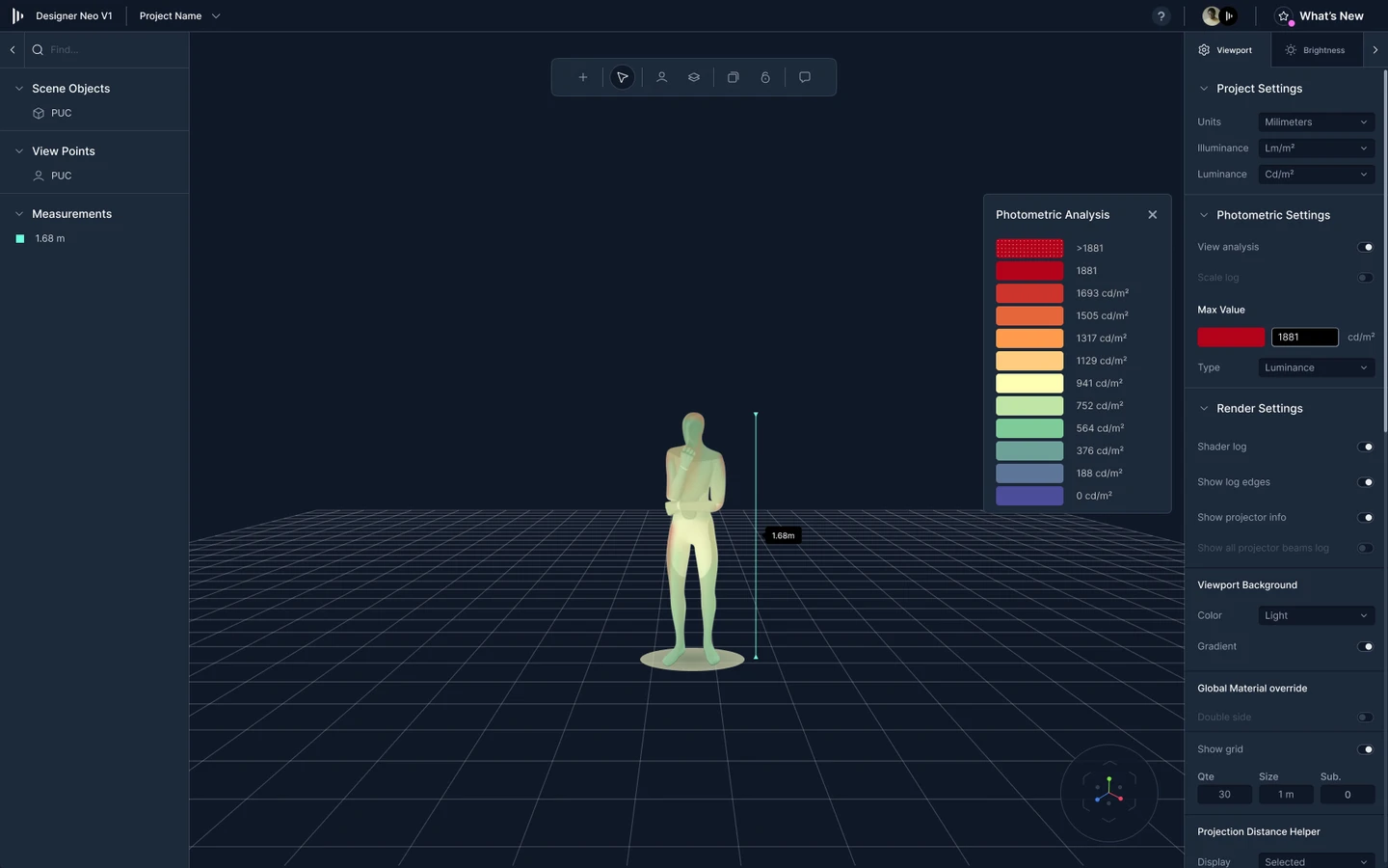
The first decision was structural. I could have improved the existing layout with better labels and grouping. I chose instead to rebuild the interface around a modular structure inspired by leading 3D tools: a left-hand toolbar for scene-specific elements, a right-hand properties panel for object and scene settings, a bottom timeline for animations and keyframes, and a central 3D viewport as the primary workspace. That structure matches how experienced production planners already think about spatial tools. It removes the learning curve before anyone has opened a single panel.
The second decision was workflow structure. Rather than a parameter-centric interface, I rebuilt the flow around task states, using progressive disclosure to surface only the controls relevant to the user's current step. The lighter approach, better labels on the existing structure, wouldn't have addressed the root cause. The mental model of the tool was misaligned with how planners actually work. Relabelling a mis-structured workflow produces marginal gains at best.
The third decision was expert capability. The obvious move was a two-mode interface: simplified for novices, advanced for experts. I rejected that. Research showed experienced users were the primary source of support requests. The problem wasn't inexperience. It was the structure forcing conscious decisions at points that should have been automatic. The redesign had to work for every skill level within the same flow.
The fourth decision was onboarding. I designed tailored tutorials and guided setup wizards for both new and legacy users. New users needed a path to first success without friction. Legacy users needed enough familiarity to trust the new version quickly. Both needed onboarding that was embedded in the tool, not bolted on.
My Role & The Team
I led the redesign as Product Experience Lead: user research, workflow modelling, information architecture, interaction design, and prototype through to a testable state. A UI designer handled visual execution within the Disguise OS design system, ensuring the redesign was consistent with the broader Disguise Cloud ecosystem. Engineering collaboration was ongoing throughout, with the software architecture shaping what was feasible to surface in the UI at each step.
The Outcome
The redesign reduced the number of conscious decisions users need to make during a projection planning sequence. That was the specific problem. Reducing it was the specific goal.
Less experienced planners can now complete projection studies without needing a senior operator present. That removes a dependency that had previously constrained how studios and production companies staffed planning work.
The modular interface structure, benchmarked against familiar 3D tools, meant experienced users could orient themselves quickly without relearning the system from scratch.
What's Next
The design intent for future iterations was deeper integration with RenderStream for real-time graphics feedback during planning, and more direct visual interaction with the projection surface to reduce manual photometric calculation work.