Context
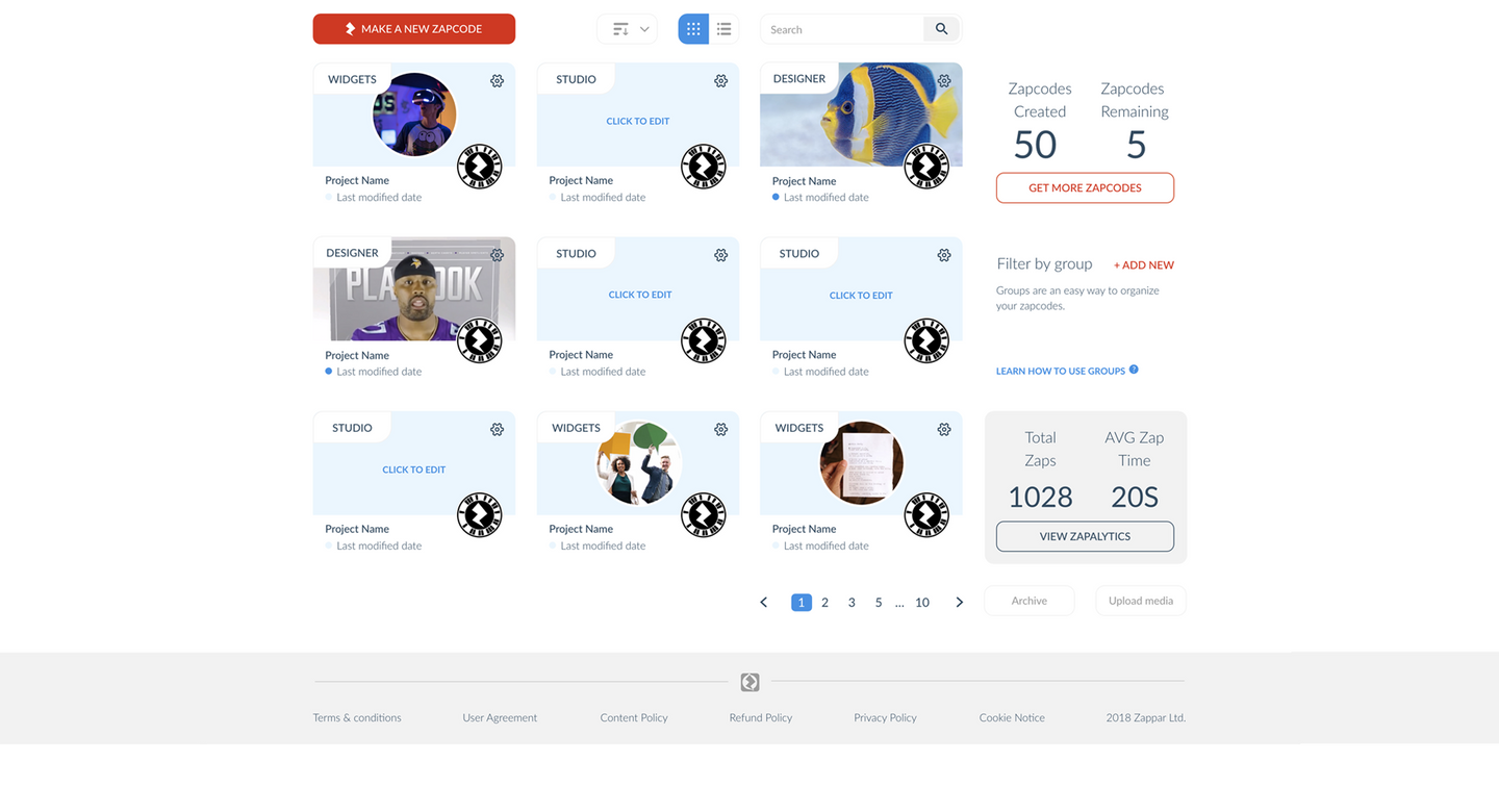
Zapworks CMS is the hub where creators manage XR projects, media assets, subscriptions, and training across the Zappar ecosystem. It started as an internal tool for Zappar's own studio, then grew to serve an external audience it was never designed for.
I joined Zappar in 2018/19 as the first UX designer. My initial task was enhancing the efficiency of the CMS while introducing new features to keep up with market demands. Over four years, that expanded into a full redesign, the introduction of Workspaces, and championing WebAR as a first-class trigger option. This case study covers the initial phase that set the direction for everything that followed.
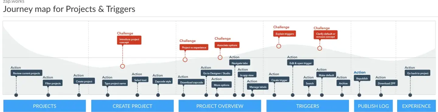
A note on terms: a trigger is the method used to launch an AR experience. It can be a URL, a Zapcode marker printed on packaging, or a QR code. Users encountering the project creation journey were being asked to choose between these options, often without understanding what any of them meant.
The Problem
Sign-up churn was high and the reason was obvious once you saw it. Zappar had just launched a polished new website. The CMS still looked like it hadn't been touched in years. Users arriving at account creation after the new website hit a wall of visual inconsistency. That inconsistency didn't just look bad. It signalled, before a user had done anything, that the product couldn't be trusted.
Below that surface problem was a structural one. Users couldn't tell the difference between Designer and Studio. They didn't understand what triggers were, or how to choose between a Zapcode and a WebAR link. They abandoned projects when the tool didn't match their expectations. The project creation journey was drowning in explanatory text that nobody was reading. Hick's Law explains this precisely: too many choices, too much information, and users stop reading and start clicking. That's exactly what the data showed.
Professional organisations had no way to manage their teams on the platform at all. The CMS had grown without a controlling logic, and it showed everywhere.
Research & Discovery
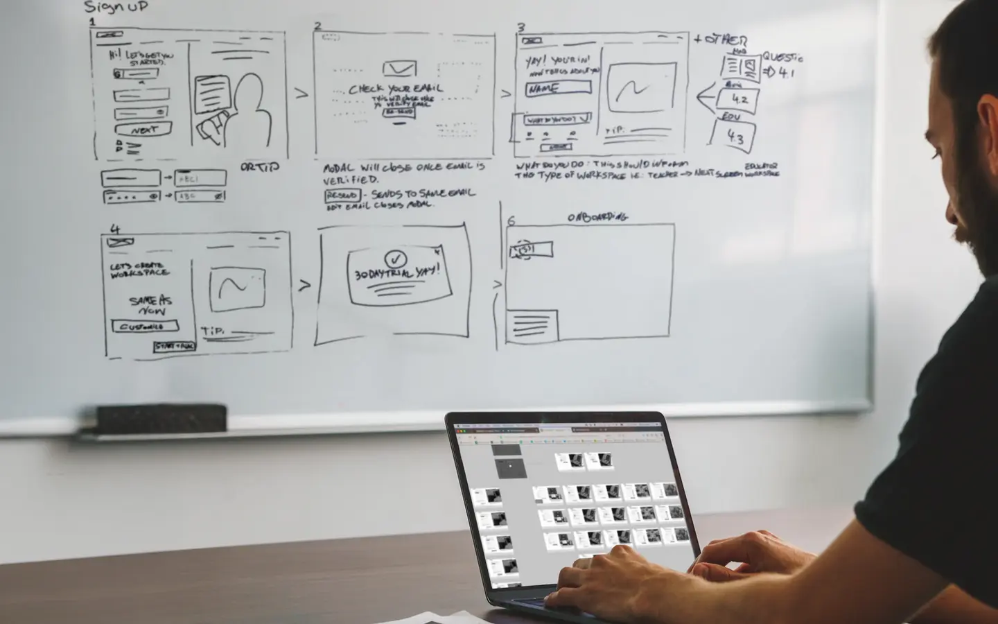
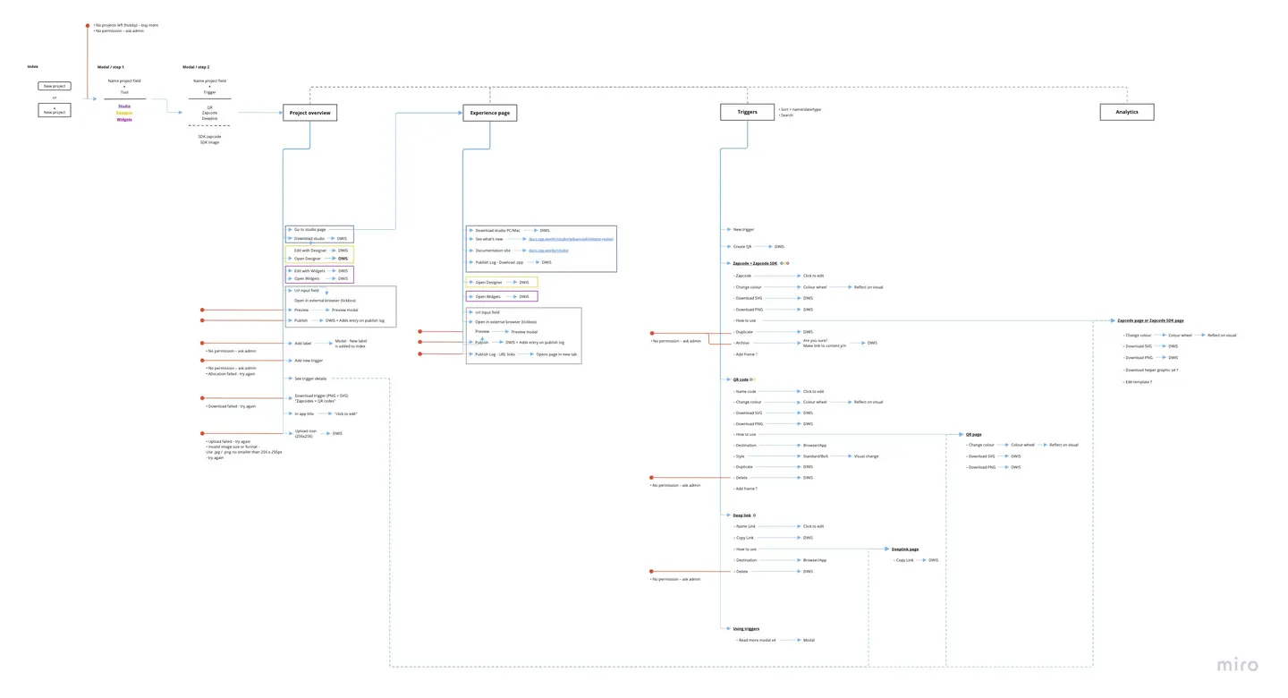
I mapped every existing user journey and the full information architecture to find where the structure was failing users and the business. Working closely with the lead developer, I audited the gap between user expectation and system logic.
I ran affinity mapping and empathy mapping sessions to define the distinct needs of different user types. Developers and marketing users had completely different goals inside the same product. I needed to understand where those goals diverged and what the CMS was actively doing to work against both of them.
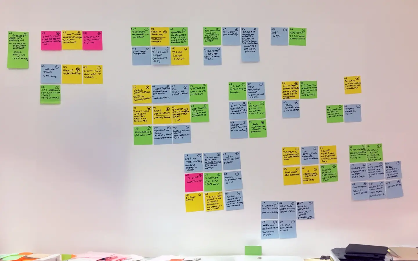
I also introduced Agile and Lean methodologies to the team. Not through process documentation. Through workshops structured around real product problems. I bought the largest whiteboard I could find and positioned it in the open office, not in a design room, so that everyone could see and contribute to the thinking. Culture change requires visibility.
User testing on the project creation journey confirmed what the data already showed. Users weren't reading instructions. They were clicking intuitively. Excessive explanation was adding cognitive load, not reducing it.
Key Findings
- Visual inconsistency between the new website and the legacy CMS was triggering immediate scepticism at account creation. Users read the mismatch as a signal that the product was unfinished or unsafe.
- Information overload in the project creation journey was the primary cause of drop-off. Users weren't reading. They were clicking what looked right, and the text was in the way. Hick's Law in practice.
- The tool differentiation problem was structural. Designer and Studio looked like equivalent options. Nothing in the CMS made the capability difference legible at the point where users needed to choose.
- Trigger confusion was widespread. Users didn't understand what triggers were or how to choose between them. Projects were being abandoned when the chosen trigger didn't match the intended use case.
- The absence of a team model was a commercial ceiling. Professional organisations needed shared workspaces with permissions, training access, and SDK management at group level. An individual account model couldn't get them there.
My Thinking
The first decision was about urgency. The alternative was a full CMS redesign shipped as a single project. I chose to execute a Brand Wash first: aligning colours, fonts, and visual styles across the entire ecosystem as a targeted initial release. The churn at account creation was an immediate business risk. A full overhaul would have taken months. The Brand Wash could be scoped and shipped quickly, and it addressed the specific cause of the trust failure directly.
The second decision was the information architecture. I chose to restructure the CMS around Workspaces: a team-based model bringing collaboration, permissions, training, and SDK access together under a single group structure. The alternative was to improve the individual-account structure with better navigation. I rejected that because the research had shown professional organisations were being structurally blocked, not just confused. Better labels on a wrong architecture just makes a tidier wrong architecture.
Persona-specific onboarding was considered at this stage: giving developers developer guidance and marketing users marketing guidance, for instance if someone was a developer they would see tips on Studio, if someone was a marketer they would see tips on Designer. We made the deliberate decision to hold off until the underlying service infrastructure could support it reliably. Shipping it half-built would have been worse than not shipping it at all.
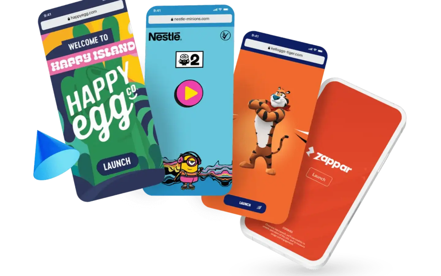
The third decision was about how AR experiences were launched. I championed WebAR as a first-class trigger option alongside Zapcodes. Zapcodes remained the right choice for customers needing deep customisation and API integration: Rovio use them for Angry Birds promotions, for example. But requiring an app download is a significant barrier for end users encountering AR on packaging or in a store. WebAR removed that barrier. Users could now access experiences through their device's browser by scanning a QR code, no app required. A Legoland experience that would have needed an app install could now be accessed instantly. Every experience built on the platform could reach a much wider audience.
My Role & The Team
I joined with a UI designer who contributed to the Brand Wash phase. When he left, I became the sole designer on the product and held that position until I hired and built out a design team of two, shifting into a leadership and mentoring role as the product matured.
The decisions about sequencing, prioritisation, and platform structure were mine, in close collaboration with the lead developer to validate what was architecturally feasible.
The Outcome
The Brand Wash re-balanced sign-up churn levels, allowing attention to move to the deeper structural problems underneath.
Workspaces gave professional organisations the team infrastructure they needed to actually work on the platform. It also made a better pricing strategy possible. Group-level value is much clearer to charge for than individual accounts.
Championing WebAR expanded the potential audience for every experience built on the platform. Removing the app download requirement is a small change with a large surface area. The CMS grew to support creators across more than 187 countries.
What's Next
The project creation journey, identified as the next highest source of friction, was scoped as a separate initiative. The goal was to empower users to confidently navigate the AR creation journey while ensuring a complete understanding of the project components: redesigning the flow, reducing cognitive load, and making the right trigger choice obvious rather than confusing.